Single-Page vs Multi-Step Forms: Which Converts Better?
Single-page and multi-step forms serve different purposes in lead generation. Here's what you need to know:
- Single-Page Forms: Best for simple tasks like sign-ups. All fields are displayed on one screen, making them quick but potentially overwhelming if too long. Keeping them short improves conversion rates.
- Multi-Step Forms: Ideal for detailed processes like surveys or onboarding. They break questions into smaller steps, reducing user overwhelm and boosting completion rates by up to 86% (HubSpot).
Quick Comparison
Feature | Single-Page Forms | Multi-Step Forms |
---|---|---|
Ease of Use | Quick and straightforward | Guides users step-by-step |
Cognitive Load | Higher for long forms | Lower due to progression |
Conversion Rates | Lower for lengthy forms | Higher for complex tasks |
Best For | Simple tasks | Detailed workflows |
Choose the right form type based on your goals: single-page forms for simplicity, multi-step forms for engagement and detailed data collection.
The Single vs. Multi Step Form Test
Single-Page vs Multi-Step Forms: Key Differences
What Are Single-Page Forms?
Single-page forms display all questions on one screen, making them quick and easy for basic tasks like sign-ups. Users can see all required fields at once and complete the form without navigating away. These forms work well for simple processes like newsletter subscriptions or collecting minimal contact details. However, when they get too long, they can feel overwhelming, which often leads to users abandoning the form.
What Are Multi-Step Forms?
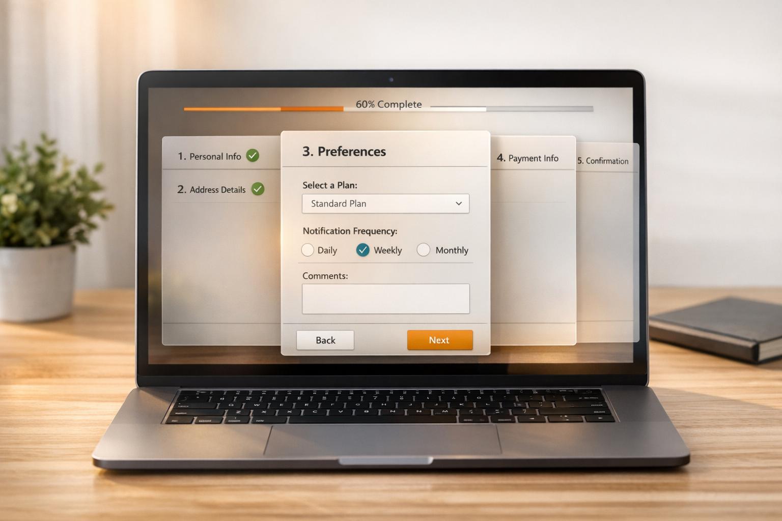
Multi-step forms break down the process into smaller sections, presenting only a few questions at a time. This approach reduces the feeling of being overwhelmed and can improve completion rates. They’re especially useful for more detailed tasks like onboarding or surveys. Research from HubSpot shows that multi-step forms can boost conversion rates by up to 86% because users feel more engaged and are less likely to quit halfway through [1]. The step-by-step method keeps users focused and committed as they move through the form [2].
Quick Comparison: Single-Page vs Multi-Step Forms
Feature | Single-Page Forms | Multi-Step Forms |
---|---|---|
Ease of Use | Quick and straightforward | Guides users step-by-step, takes longer |
Cognitive Load | Can feel heavy for complex forms | Lighter due to gradual progression |
Conversion Rates | Lower for lengthy forms | Higher for multi-step processes |
Ideal Use Cases | Simple tasks like sign-ups | Detailed tasks like onboarding or surveys |
How Single-Page and Multi-Step Forms Perform
Research on Form Performance
Data shows that the structure of a form can significantly influence its success. For example, Formstack reports that multi-step forms have a conversion rate of 13.9%, compared to just 4.5% for single-page forms. Similarly, HubSpot found that multi-step forms can increase conversions by 86% in more complex scenarios [1][2]. This makes multi-step forms a strong choice for collecting detailed information.
On the other hand, Neil Patel's research highlights the importance of simplicity for single-page forms. Forms with only three fields see a 25% conversion rate, but this drops to 15% when more than six fields are included [3]. The takeaway? Keeping single-page forms short and focused is critical for better results.
How User Behavior Affects Form Completion
The success of multi-step forms can often be explained by how they align with user behavior. Features like progressive disclosure and commitment psychology play a big role. By breaking the form into smaller sections, users feel less overwhelmed and are more likely to complete the process.
Here are some behavioral factors that influence form completion:
- Progressive disclosure: Breaking information into steps helps users stay focused.
- Commitment psychology: Once users start, they're more likely to finish.
- Visual progress indicators: Showing progress keeps users motivated.
- Mobile-friendly design: Simplifies the experience on smaller screens.
Multi-step forms are especially effective for mobile users, who often find long single-page forms difficult to navigate [1][2]. By splitting the process into manageable parts, multi-step forms reduce mental effort, making them easier to complete on mobile devices.
Understanding how these factors impact performance is just the beginning. Next, we’ll dive into actionable tips for improving both single-page and multi-step forms.
sbb-itb-5f36581
Tips for Improving Form Performance
How to Improve Single-Page Forms
Single-page forms can achieve strong conversion rates when designed thoughtfully. Here are some effective tips:
- Trim unnecessary fields to keep the form short and user-friendly.
- Position the form prominently on the page and minimize distractions around it.
- Use white space strategically to make the form visually appealing and easy to focus on.
- Write clear, action-driven CTAs that highlight the benefit (e.g., "Get My Free Guide" instead of "Submit").
How to Improve Multi-Step Forms
Multi-step forms are great for gathering detailed information without overwhelming users. To make them more effective:
- Add progress indicators like visual bars or step counters so users know how far along they are.
- Incorporate conditional logic to tailor the form by showing only relevant fields based on previous responses.
- Organize the form into logical sections (e.g., personal details, preferences, final confirmation) to create a smooth flow.
These adjustments can make multi-step forms feel less daunting and improve completion rates.
Best Tools for Building Forms
The right tools can make creating high-performing forms easier. Platforms like Reform offer helpful features to boost conversions, such as:
- A/B testing to fine-tune form performance with data-backed insights.
- Conditional logic for creating personalized user experiences.
- Advanced analytics to monitor and improve completion rates.
- Mobile-friendly designs to ensure accessibility across devices.
- Lead enrichment and validation tools to improve data quality.
For the best results, choose tools with robust A/B testing options to identify what works best for your audience [4].
Conclusion and Final Thoughts
Key Takeaways
Single-page and multi-step forms both serve as solid tools for lead generation, but their effectiveness depends on the situation. Multi-step forms tend to perform better in detailed or complex scenarios, often leading to higher conversion rates. On the other hand, single-page forms are ideal for gathering basic information, especially from first-time visitors or for simpler tasks.
Picking the Right Form for Your Needs
The choice between single-page and multi-step forms comes down to your goals and audience. Consider how users interact with your process and the type of information you need to collect.
- Single-page forms work best for straightforward tasks, like quick sign-ups with a few fields.
- Multi-step forms are better for collecting more detailed data, managing complex workflows, or keeping users engaged step by step.
FAQs
Are multi-step forms better?
Multi-step forms can boost conversion rates by as much as 86% compared to single-page forms [1]. They work especially well for detailed processes like onboarding or surveys. On the other hand, single-page forms are better suited for quick tasks with fewer fields. Multi-step forms also help qualify leads by collecting information strategically. The best choice depends on how complex your workflow is and the type of data you need.
What is the difference between single-step forms and multi-step forms?
The key difference lies in how they are structured. Single-page forms show all fields at once, while multi-step forms break the process into smaller, guided steps. This difference can have a big impact on user engagement. For example, Imagescape saw a 120% increase in conversions after reworking their form layout [3].
What is a good conversion rate for forms?
Conversion rates vary by industry and audience. Here's a breakdown of typical rates:
Industry | Average Conversion Rate |
---|---|
B2B Services | 2.23% |
SaaS | 3.0% |
E-commerce | 2.58% |
Lead Generation | 2.35% |
To improve your form's performance:
- Focus on matching form complexity to your audience's expectations.
- Limit questions to only what's necessary.
- Experiment with different layouts to see what works best.
- Use user behavior data to refine your fields.
These tips can help you align your form design with your audience's preferences and your business objectives.
Related posts
Discover proven form optimizations that drive real results for B2B, Lead/Demand Generation, and SaaS companies.
Get new content delivered straight to your inbox
The Response
Updates on the Reform platform, insights on optimizing conversion rates, and tips to craft forms that convert.
Drive real results with form optimizations
Lorem ipsum dolor sit amet, consectetur adipiscing elit. Suspendisse varius enim in eros elementum tristique.